Multivariate Analysis
Published:
Introduction
Transitioning from an academic background to data science, I’ve observed differences in the tools employed for data analysis. One notable example, seemingly underutilized in data science projects, are multivariate statistical techniques. These methods, entailing the simultaneous consideration of multiple variables, excel at unveiling intricate relationships, extracting hidden patterns, and offering a more comprehensive understanding of complex datasets.
Within this portfolio project, my intention is to showcase several multivariate statistical analysis tools that I find valuable with the ultimate goal of creating a prediction model of whether deliveries will be on time or late. The included multivariate tools include:
- Principal Component Analysis (PCA)
- Multivariate Analysis of Variance (MANOVA)
- Discriminant Analysis
(Note: This project is written for an audience that has some basic stats background.)
Dataset description
First, let’s take a look at the data. I downloaded a dataset labeled “E-Commerce shipping data” from Kaggle’s data repository. The dataset includes customer shipment data from an international e-commerce electronics company. However lets be honest, this may or may not be a real dataset. The observation level (rows) of the dataset is individual shipments to customers along with various collected data for each shipment (columns). Accompanying each observation is a customer ID along with 5 categorical features and 6 numeric features.
Categorical data
The Categorical features or factors each had multiple levels (or unique values). The following tables shows each factor and their related factor levels:
| Factor | Levels |
|---|---|
| Warehouse_block | A, B, C, D, F |
| Gender | M, F |
| Reached.on.Time_Y.N | 1, 0 |
| Mode_of Shipment | Flight, Ship, Road |
| Product_importance | low, medium, high |
Remember that the ultimate goal in this analysis is to end up with a prediction model for on-time delivery. So, the Reached_on_time feature is our feature of interest.
Numeric Data
The six numeric features were: Customer_care_calls, Customer_ratings, Cost_of_Product, Prior_purchases, Discount_offered, and Weight_in_gms. I think the names of the variables explain what they are pretty well but if you want more detail please follow the link at the end of this section where the original metadata is included.
Pairwise Scatter Plots
Before jumping into the multivariate analysis, I think we should look at the numeric features in a bit more detail. Below I have created a pairwise matrix panel plot which showcases the relationships within and between the numeric variables.
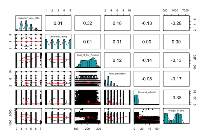
Some things that I think are important to note are that no two variables are highly correlated. Also, we have some interesting distributions within the features. Not all of them are normally distributed as none of the values can be negative and some features can only be integers. Finally, I want to note the bimodal pattern in the shipment weight feature where there seems to be a concentration of both smaller and larger shipments.
Within this dataset we find many numeric and categorical features. Although not a perfect dataset (I’ll cover why that is later), I think the data is organized in a way to showcase some multivariate techniques. We can think of each of the numeric variables as coming from a shared multivariate distribution.
NOTE: If you’re interested here is a link where you can download and learn more about the data set. Shipping data set
Principal Component Analysis (PCA)
The first multivariate technique I want to go through is PCA. PCA is a dimensionality reduction technique that transforms high-dimensional data into a lower-dimensional space while retaining as much variance as possible. It achieves this by identifying and emphasizing the principal components (PC), which are linear combinations of the original features. Each PC is perpendicular or orthogonal to the other in geometric space, so all PCs are uncorrelated. I find that PCA is a great first analysis of a multivariate dataset and is great for getting more familiar with it. If you want to learn more about PCA I think the best place to start is this StatQuest youtube video titled; “StatQuest: Principal Component Analysis (PCA), Step-by-Step”.
I used the base R function “princomp” to compute the PCs across the 6 numeric features in the dataset. Because there are 6 features available for the PCA there will be a total of 6 PCs calculated. Also, it should be noted that PCA can be performed on either the covariance or correlation matrix of the features. You would typically pick the covariance matrix if the data were standardized or on the same scale otherwise, I would suggest using the correlation matrix.
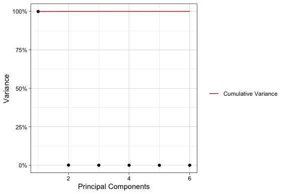
A classic way of visualizing PCA and interpreting is by way of a scree plot. A scree plot shows the amount of variance each PC accounts for compared to the total variance in the dataset. You would typically cut your PCA off at some threshold percent of variance, hence PCA being a dimensionality reduction procedure. There is no official cutoff for choosing the number of PCs, but a good rule of thumb is to look for the “elbow” in the scree plot.

Unfortunately, this is not a good example of a scree plot with an “elbow”, but this does provide an interesting example. This data set was highly variable across all available dimensions. For instance, it takes 5 dimensions to reach 80% of the dataset’s variance!
Before moving on I want to show why we should use the correlation matrix (or standardize the variables) rather than the covariance matrix for this analysis. The following plot is the same scree plot but using PCs calculated from the covariance matrix.
If one were to use the PCA used to generate the second scree plot they would think that all the variation in the dataset is in one dimension and completely miss a key aspect of this data. The culprit of the misleading result in the second scree plot is the vastly different scales of data, particularly for the shipment weights compared to the rest of the features.
Finally, a great way to demonstrate the results of PCA is using a biplot. A biplot visualizes the PC loadings for the features and the PC scales for the data. The loadings are the linear combinations of the features, and the scores are where the individual observations in the data fall. We can lean a ton about our data given a well-crafted biplot.
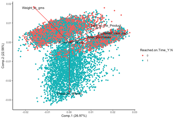
The displayed biplot has a lot going on so I’ll walk you through it. First, the x and y axis show the first two principal components in the data, which account for a little over half the total variance. Next, the loadings shown by the arrows and are labeled accordingly. The arrows display the linear combinations of the respective features for that PC. We can tell which is most associated with a particular PC by the length and direction of an arrow. For instance, Cost_of_product displays most of the variations of PC1 and discount_offered displays most of the variation for PC2. Additionally, the angle of the arrows compared to each other indicates the correlation (or lack of) between features. An acute angle indicates positive correlation, a right angle indicates no correlation, and an obtuse angle indicates negative correlation. The points are the PCA scores for the observations, meaning that they are where the data falls when applying the linear combinations of the features. Looking at PCA scores can tell us where data groups based on features and can hint at possible outliers at the multidimensional level. I also included a coloring of the scores to indicate on-time delivery (1 = on-time, 0 = late). Later in this project I will show some predictions and a biplot of the PCs can help to identify if groups can be separated at the multidimensional level. Finally, I want to note that for a dataset like this where there are high variations amongst 5 different dimensions you would want to generate pairwise biplots of the PC’s.
What did we learn and can apply to our prediction model from PCA?
- It takes at least 5 PCs to account for 80% of the dataset’s variance.
- Given the biplot of the first 2 PCs it appears that grouping of on-time delivery may be possible.
Multivariate Analysis of Variance (MANOVA)
MANOVA, or Multivariate Analysis of Variance, is a statistical technique used to analyze the differences among group means in a multivariate data set. It extends the analysis of variance (ANOVA) to cases where there are two or more dependent variables. In other words, MANOVA allows researchers to simultaneously assess the impact of one or more independent variables on multiple dependent variables.
The primary goal of MANOVA is to determine whether there are any significant differences between the means of groups while considering the relationships among the dependent variables as a whole. This makes it a powerful tool for researchers who are interested in understanding how several variables respond to changes in one or more independent variables, and whether those responses are statistically significant.
In MANOVA the hypothesis test is designed to assess whether there are statistically significant differences in the mean vectors of multiple dependent variables across different groups. The null hypothesis and alternative hypothesis for MANOVA can be stated as follows:
Null Hypothesis (H0):
There is no significant difference in the mean vectors of the dependent variables across the groups. In other words, the group means are equal.
Alternative Hypothesis (H1):
There is a significant difference in the mean vectors of the dependent variables across at least two groups.
There are a bunch of different ways to calculate the test statistic and subsequent p-value. I will just use the default in R, Pillai’s Trace. If the p-value associated with the chosen multivariate test statistic is less than the predetermined significance level (commonly denoted as α), typically 0.05, then the null hypothesis is rejected. This implies that there is evidence to suggest that at least two group means are different in terms of the dependent variables.
You may be wondering why perform MANOVA when you could just do multiple ANOVAs? And it boils down to reduction of type one error. Multiple comparisons increase the likelihood of Type I error because, as more tests are conducted on the same data set, the probability of obtaining at least one significant result due to random chance alone becomes higher, leading to a greater risk of falsely rejecting a null hypothesis. Thus, MANOVA is more powerful in finding significance in data without type one error. Of course, if/when significance is determined at the multivariate level post hoc analysis is needed to identify where data specifically differs.
My aim is to investigate potential differences among the various levels within each factor across the given numeric features. Then use this gained knowldge to craft a prediction model for on time deliveries. Consequently, the null hypothesis in the MANOVA I conducted posits that there are no differences in the mean vectors of the numeric features across any of the factors, while the alternative hypothesis suggests that at least one difference exists.
I preformed the MANOVA using the base R function manova() using all the numeric and categorical varibles. The output is shown below:
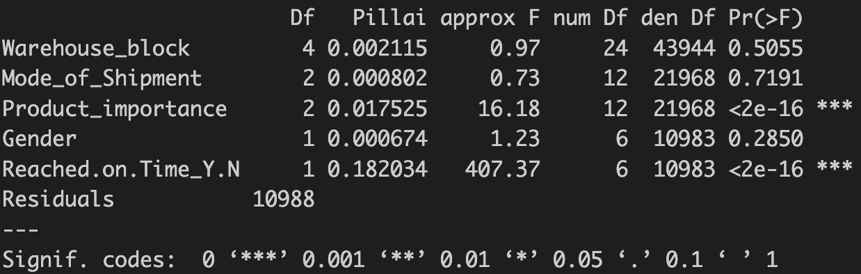
Given the calculated p-values I rejected the null-hypothesis and concluded that there are differences at the multivariate levels for both product importance and on-time delivery.
When it comes to MANOVA there are a few different ways to follow up a significant result and what you would do depends on the characteristics of the data. In this data I am interest in which specific numeric features that difference exists for across the two significant factors. So, from there I preformed univariate ANOVAS for each of the numeric features for product importance and on-time delivery. I won’t bore you with the details but the table below shows the results.
| Numeric Feature | Product importance | On-time Delivery |
|---|---|---|
| Customer_care_calls | sig | sig |
| Customer_ratings | non-sig | non-sig |
| Cost_of_product | sig | sig |
| Prior_purchases | sig | sig |
| Product_weight | sig | sig |
| Discount_offered | sig | sig |
From here you can do pairwise post-hoc test to see which groups specifically differ, but I won’t get into that.
We must assume that the independence of observations was maintained during the data collection process. However, we need to examine the other three assumptions. I previously hinted at an issue with the first one, as not all variables follow a normal distribution. We can assess the Homogeneity of Covariance Matrices using a Box’s M Test. Without delving into the specifics, it’s worth noting that these assumptions are not satisfied. Although I don’t believe they entirely invalidate the results, it is crucial to scrutinize and acknowledge any deviations from these assumptions when reporting findings.
What did we get from the MANOVA and can apply to prediction model?
- There is a significant diffences between factors at the multivariate level meaning we should preform post-hoc tests.
- There are significant differences at the univariate levels for product importance and on-time delivery groups for all numeric features except customer ratings
Discriminant Analysis
Both the PCA and MANOVA have been leading this final analysis, where the goal is prediction. The guiding question is, can we predict on-time delivery using the multivariate dimensionality of the dataset?
First, what is Discriminant Analysis (DA)? It is a statistical method for classifying observations into predefined groups. DA finds the linear combinations of the multivariate data that best separates into the chosen groups. It is similar to PCA in theory and in some of the mathematics behind the scenes, but it is more statically driven while PCA is more mathematically driven. Within DA we can use linear or quadradic, where the decision boils down to whether the covariances of the multivariate data can be shared. Since we found earlier that the covariance matrices cannot be shared, I used quadradic DA. Also, I have to plug StatQuest again here is another great video by them if you want to learn more about DA.
Thus, using the qda() function included in R-library MASS I performed quadradic discriminant analysis on the variables determined to have significant differences on the delivery time from the MANOVA and subsequent ANOVA. The model was fit on a training dataset comprised of 85% of the original dataset randomly selected and the prediction accuracy was tested on the remaining 15%.
We’ve already looked at the data quite a bit, so I’ll just show the results of the prediction on the testing data set. The total prediction accuracy was 68.7%. I think that considering the complexities and multidimensionality of this dataset this is not bad. What I think is especially interesting is the confusion matrix that resulted from the predictions and the resulting conclusions.
| Actual - on time | Actual - late | |
|---|---|---|
| Predicted - on time | 446 | 15 |
| Predicted - late | 501 | 688 |
So what did we learn from the DA?
- On time deliveries can be predicted with moderate accuracy.
- The vast majority of incorrect prediction were shipments predicted to be late but were on time.
- If a shipments was predicted to be late it was only a 42% chance it was actually late.
- If a shipment was prediccted to be on time there was a 97% chance is was on time.
The company producing this data can leverage the information effectively. For example, by applying the model to shipment data, predictions can be generated regarding whether a shipment will be on time. If the prediction indicates on-time delivery, the company can have high confidence in the timeliness. In cases where a late delivery is predicted, there’s approximately a 50% chance it will occur. This allows the company to proactively inform customers about potential delays, enhancing customer satisfaction through timely warnings. Moreover, the company can develop intervention strategies for shipments predicted to be late, further optimizing operational efficiency.
What’s next? Following up this analysis I would dive into the specific variables to find what exactly is causing shipments to be late. I didn’t go into this because I wanted to stay high level and stay in multivariate space.
Conclusion
Multivariate techniques stand out as valuable assets for data science applications. Their ability to analyze relationships among multiple variables simultaneously makes them powerful tools for uncovering complex patterns and extracting meaningful insights from diverse datasets. Their versatility ensures broad applicability across various data science tasks, such as classification, clustering, and dimensionality reduction, making them essential in navigating the complexities of modern data.